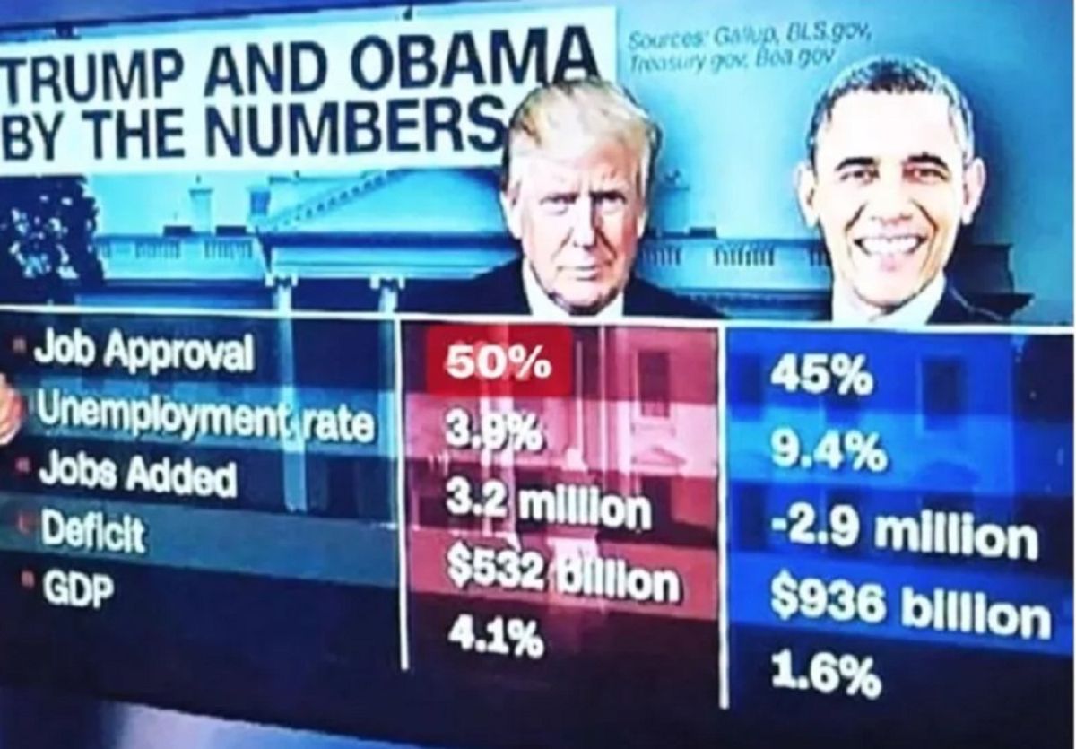

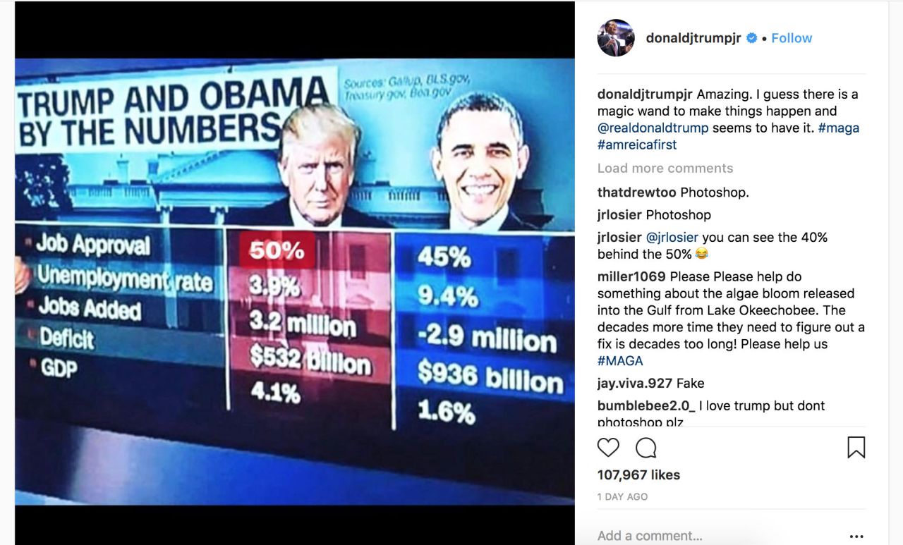
An image purportedly reproducing a CNN graphic comparing Presidents Trump and Obama "by the numbers" -- with the former seemingly recording a significantly higher job approval rating than his predecessor -- received a viral push on 8 August 2018, when Donald Trump, Jr. shared it with his 1.2 million followers on Instagram:
However, the image was a doctored version of a graphic that was originally used during a CNN fact-checking segment regarding a tweet posted by President Trump about his approval numbers:
Presidential Approval numbers are very good - strong economy, military and just about everything else. Better numbers than Obama at this point, by far. We are winning on just about every front and for that reason there will not be a Blue Wave, but there might be a Red Wave!
— Donald J. Trump (@realDonaldTrump) August 5, 2018
CNN's John King fact checked this tweet by comparing Presidents Obama and Trump "by the numbers" from around the same point of times in their presidencies. The image posted by Trump Jr. showed his father with a 50% job approval rating, but the genuine graphic aired by CNN showed President Trump's approval rating at only 40%.
Here's the original segment from CNN:
A side-by-side comparison clearly shows how a "50%" was digitally edited (quite poorly) in place of the "40%" number in the original graphic:
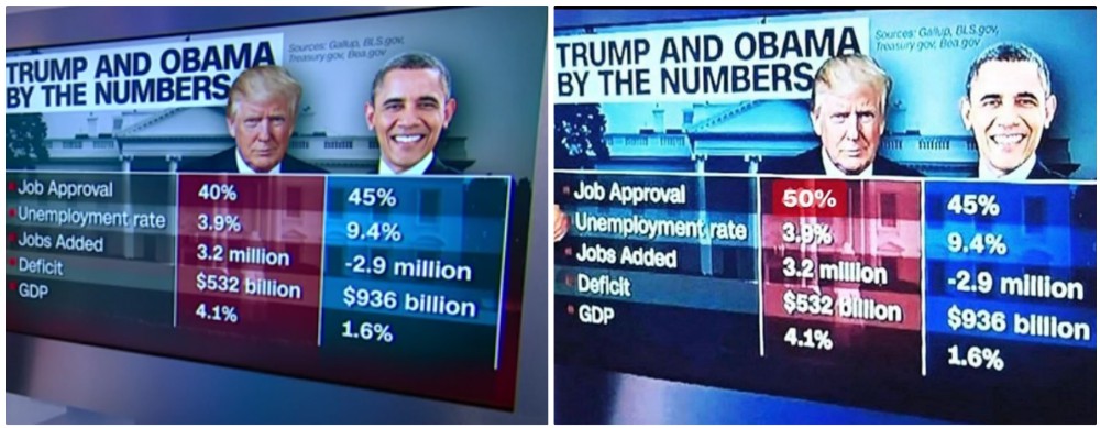
The job approval statistics used by CNN for this graphic were taken from Gallup. According to that polling company, which samples presidential approval ratings every week, President Trump had never held a 50% approval writing up to the point of the CNN segment.
Donald Trump, Jr. later removed the doctored image from his Instagram page.
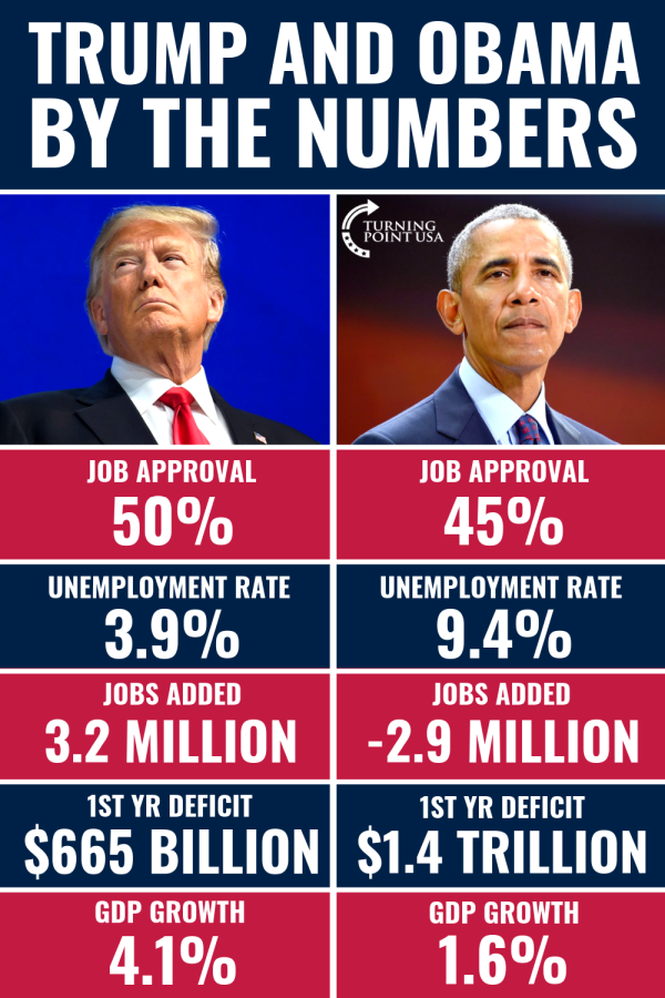
An expanded version of the chart began making the rounds in September 2018 in the form of a meme shared by Turning Point USA, a conservative group whose stated mission is "to identify, educate, train, and organize students to promote the principles of freedom, free markets, and limited government."
Apart from repeating the inaccurate "50 percent" approval rating for Trump and substituting year-to-date federal deficit figures with first-year-in-office totals for both Trump and Obama, the Turning Point USA chart faithfully copies the information provided in the August CNN segment.
As CNN correspondent John King pointed out in that segment, the numbers reflect favorably on Trump. In terms of comparing Trump to Obama, however, the meme omits important contextual information. First, the figures cited were snapshots of a particular point in each president's administration. They didn't reflect longer-term fluctuations and trends. Second, unlike Trump, Obama entered office in the midst of a devastating economic collapse. Trump inherited an economy that was already strong and growing. It's meaningless to compare the two without taking these factors into account.
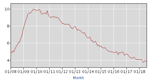
Unemployment rate: As stated in the meme, the unemployment rate in July 2018 was 3.9 percent, as compared to 9.4 percent at the same point in Obama's first term in office (July 2010). But that number fell during 2011 as the economy began to recover, and, apart from minor fluctuations, fell steadily every year thereafter. By December 2016 (Obama's last full month in office) the unemployment rate was down to 4.7 percent and still falling, as illustrated in this U.S. Bureau of Labor Statistics graph:
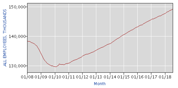
Jobs added: According to the Bureau of Labor Statistics, total non-farm employment in the U.S. grew from 145.7 million in January 2017 to almost 149 million in June 2018 -- an increase of approximately 3.2 million jobs. The same source reported that by the exact same point in Obama's first term, the economy had lost some 3.5 million jobs since January 2009 (.6 million more than was claimed by CNN and the Turning Point USA meme). But, again, the recession was underway, and the economy had already shed nearly 3.6 million jobs during the 12 months before Obama took office. The employment rate began to improve in 2011 and did so steadily throughout the rest of Obama's two terms:
First year deficit: The Congressional Budget Office reported in March 2018 that the federal deficit stood at $665 billion (equivalent to 3.5 percent of the Gross Domestic Product) at the end of 2017, Trump's first year in office. At the end of Obama's first year, 2009, the deficit was $1.4 trillion (9.9 percent of GDP, the highest deficit as a share of GDP since 1945). It was mostly attributable to spending on the stimulus package meant to rescue the U.S. economy from the recession. Deficit spending didn't remain that high throughout Obama's tenure, however. In fact, the deficit during each of the last three years of his term of office ($485 billion in 2014, $438 billion in 2015, and $585 in 2016) was lower than the 2017 deficit, as well as the projected $833 billion deficit for 2018.
GDP growth: The growth rate of the Gross Domestic Product reflects the health of the economy in terms of the value of all goods and services produced in a given time period. As of the end of the second quarter of 2018, the rate of GDP growth was 4.2 percent (revised upward from 4.1 percent), as compared to a rate of 1.6 percent in the second quarter of 2010, Obama's second year in office. The quarterly GDP growth rate can be volatile, however. It reached or surpassed the 4 percent mark on four separate occasions during the Obama administration, including hitting a high point of 5.2 percent in the third quarter of 2014:
source: tradingeconomics.com
Changes in economic indicators are a valid way of evaluating the effectiveness of presidents and their policies, but, as in the examples above, when they are taken out of context and oversimplified they can be more misleading than enlightening.